From frustration to flow:
From frustration to flow:
I redesigned an enterprise timesheet system to make time entry intuitive, fast, and error-free.
This case study is intentionally limited in scope due to NDA. For more information, contact me.
Role: Product Designer Time: 12 Months
Role: Product Designer Time: 12 Months
Role: Product Designer Time: 12 Months
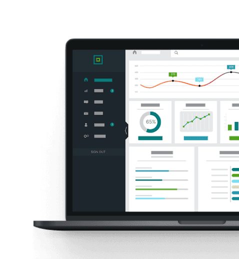
Quick snapshot
This enterprise solution was birthed from the need to simplify timesheet management and reduce employee frustrations. Users faced challenges with unclear controls, inputting time in the required format, and attaching supporting documents, leading to errors, disapproved submissions, and wasted time. The redesign aimed to create a more intuitive, efficient, and user-friendly system.
This enterprise solution was birthed from the need to simplify timesheet management and reduce employee frustrations. Users faced challenges with unclear controls, inputting time in the required format, and attaching supporting documents, leading to errors, disapproved submissions, and wasted time. The redesign aimed to create a more intuitive, efficient, and user-friendly system.
The legacy timesheet system created friction and inefficiencies for users. Based on 40+ customer suggestions and direct feedback from internal teams:
● Controls were unclear
● Time input formats frequently caused errors
● Attaching documentation was clunky
● Accessibility and compliance barriers existed
This led to disapproved timesheets, wasted time, and low satisfaction.
To address customer concerns and existing pain points, I redesigned a WCAG-compliant, user-centered timesheet experience that simplified workflows and aligned with business goals like customer retention, NPS growth, and upmarket expansion.
● Prioritized top-voted user suggestions and Amplitude usage data
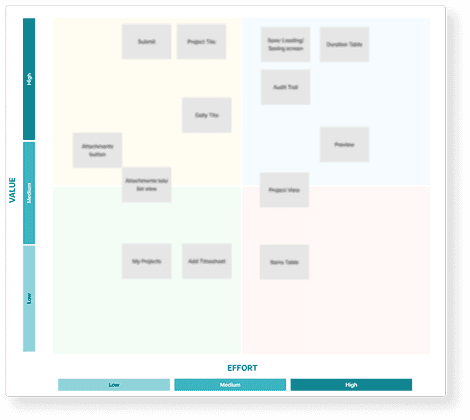
● Defined MVP using a Value vs. Effort matrix
● Designed for responsiveness and accessibility from the start
● Ran 30 user testing sessions and 15 stakeholder reviews
● Rolled out features in phases through a staggered beta program
● Prioritized top-voted user suggestions and Amplitude usage data
● Defined MVP using a Value vs. Effort matrix
● Designed for responsiveness and accessibility from the start
● Ran 30 user testing sessions and 15 stakeholder reviews
● Rolled out features in phases through a staggered beta program
● 28% increase in daily time entry
● 10% reduction in the average time spent entering time
● 18% decrease in support tickets related to time entry.
● Streamlined time entry with editable smart defaults
● Inline comment input directly in the timesheet table
● Effortless document attachment flow
● Modern, responsive UI for web and mobile
Want to deep dive? Keep scrolling to learn more
Want to deep dive? Keep scrolling to learn more
The timesheet feature was a frequent source of user frustration. Users struggled with unclear controls, incorrect time formats, and difficulties attaching supporting documents, leading to errors and wasted time. Many also voiced a need for more customization and additional features to better fit their specific workflows. These issues not only hindered productivity but also impacted payroll, compliance, and client billing.
I began by analyzing 40+ customer suggestions from our support and customer success channels, as well as user behavior data from Amplitude. I also reviewed recordings and feedback from previous user sessions. Our internal teams (Support, CS, and Engineering) flagged pain points around time entry errors, document uploads, and mobile responsiveness.
● The feedback was scattered across multiple channels, so consolidating and prioritizing it was time-consuming.
● Some user complaints contradicted others, which made it difficult to determine which issues had the highest impact.
I synthesized feedback into clear themes and ran a quick impact vs. effort matrix to help prioritize fixes. I also conducted brief interviews with power users to validate my findings.
This image has been blurred or modified to comply with NDA restrictions and protect confidential information.
This image has been blurred or modified to comply with NDA restrictions and protect confidential information.
After reviewing the data, I created user personas and journey maps focusing on two types of users: project-based employees who entered time daily, and administrators who reviewed and approved entries. These helped ground the redesign in real user workflows and frustrations.
Some of the most active users were under tight time constraints and couldn’t commit to lengthy interviews, while admins had niche needs tied to government compliance that I needed to understand without direct access to sensitive data. To work around this, I partnered closely with the compliance and customer success teams to gain clarity on constraints without exposing any confidential contracts. I also created short, asynchronous surveys that allowed busy users to share valuable feedback on their own time.
Install the plugin and convert your designs to With clear pain points and personas in hand, I ran several ideation sessions using “How Might We” prompts to explore potential solutions. I involved stakeholders early to validate feasibility and align with business goals. responsive site.
One of the biggest challenges was balancing simplicity with the need to introduce new features like customization, comments, and file attachments. At the same time, the product had to meet strict WCAG accessibility standards and government contractor compliance rules. To address this, I explored multiple UX patterns to reduce friction while still supporting advanced functionality. I leaned into progressive disclosure to minimize cognitive load—keeping the interface clean and intuitive for everyday users, while enabling power users to access more robust features when needed.
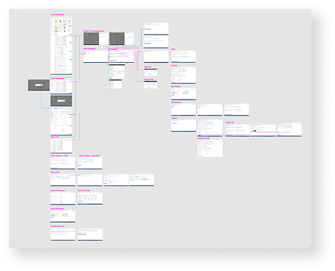
I began designing mid-fidelity wireframes to test layout ideas, focusing on editable time entry, in-table comments, and a simplified file upload system. I then built a prototype using Figma and began iterating.
● Getting stakeholder alignment on what to include in the MVP.
● Engineering flagged concerns about legacy tech limitations and mobile responsiveness.
I began the design process by sketching initial concepts and building low-fidelity wireframes, which I reviewed during collaborative ideation sessions with the development teams to gather early feedback. From there, I created high-fidelity, responsive mockups and interactive prototypes using Figma for our usability testing sessions.
I ran 30+ moderated and unmoderated usability tests with internal and external users. I tested key flows like entering time, adding documentation, and using the tool on mobile.
During testing, some users were hesitant to give honest feedback with stakeholders present, which made it difficult to surface critical usability issues. Additionally, accessibility testing revealed several problems with color contrast and keyboard navigation. To address these challenges, I conducted independent user tests and anonymized the results to encourage more candid responses. I also partnered closely with the QA team to ensure all accessibility standards were met consistently across the product.
Based on user feedback, I made several refinements, improving iconography, fixing navigation issues, and simplifying the document attachment flow. I collaborated closely with engineers to ensure a smooth handoff and pixel-perfect implementation. One challenge was that a few features had to be cut from the MVP due to technical constraints. Aligning with cross-functional teams during refinement also caused some delays. To manage this, I focused on updates with the biggest impact on usability and worked with PMs to scope the removed features into a Phase 2 roadmap. I also created detailed spec docs and used Figma’s component system to streamline the handoff process.
This image has been blurred or modified to comply with NDA restrictions and protect confidential information.
This image has been blurred or modified to comply with NDA restrictions and protect confidential information.
I facilitated a phased rollout through a staggered beta, allowing teams to slowly adopt and provide feedback. I created documentation, design tokens, and annotated prototypes to ensure a smooth handoff. Finally, I held regular design QA sessions with engineers, stayed close to customer support during rollout, and flagged low-priority feedback for post-launch.
● 28% increase in daily time entry
● 10% reduction in time spent logging hours
● 18% decrease in time-related support tickets
● Strong praise from internal testers calling the UI “intuitive” and “stress-free”
● Small changes (like inline editing and better icon placement) made a huge impact
● Testing with real users, not just stakeholders, led to better accessibility and usability
● A phased release helped build trust and made adoption smoother
● Designing with developers early in the process reduced rework and scope delays
● Following the success of the MVP rollout, we began planning Stage 2, which includes:
● Expanded customization options
● Offline entry support
● Approver-side view improvements I also pushed to incorporate analytics dashboards to help users track their own hours and submissions over time, further reducing the burden on admins.
Read more of my case studies